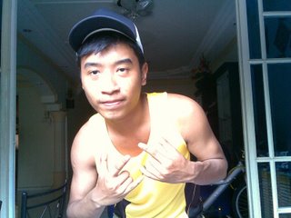
 The photo below is my orginal, unedited version.
Bloack and white seems dull. And the words are not the least interesting at all. Why did I ever put this photo to a black and white mode? - Ugly! I need help from the professionals. I asked Runie for help for my photo. Okay, he's not exactly a pro but at least his work is somewhat impressive.
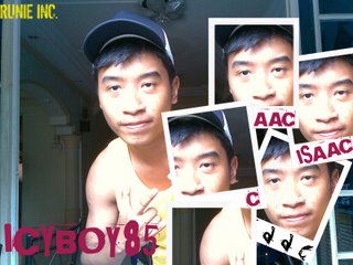
 He placed a small face poster of me at the bottom right of the photo with my name on it.
I said, "Cool!"
Then, I become more greedy.
"Runie, can you add more spice to the photo?"

No comments:
Post a Comment